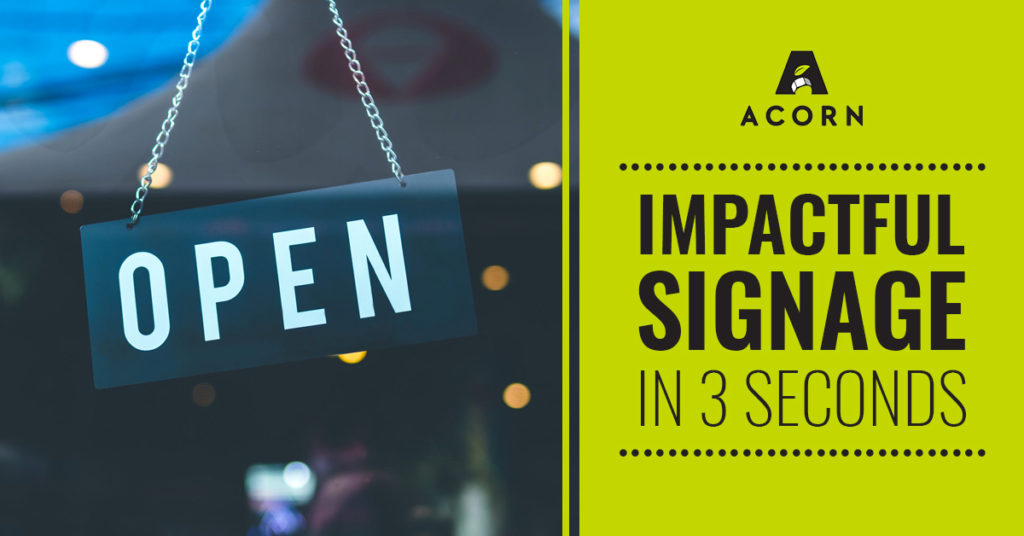
First impressions of your company are important for reaching new customers and shaping their perspective of your business. Signage plays a large role for your company in built environments, so it’s crucial to understand different measures of how to cultivate your best first impression for those who interact with your business in physical spaces. Studies show that your signage has three seconds to make an impact on a consumer, so it’s crucial to develop signage that communicates your message quickly and effectively.
When analyzing how to make the best first impression with your signage in three seconds or less, focus on simplicity and clarity. Below are some ideas to remember when developing your signage and messaging to create a strategic first impression.
Typography and Color
As you design signage throughout your physical space, you can ensure legibility by using bold, sans serif fonts rather than script fonts or fonts with thin strokes. Using colors with high contrast will also allow your typography to be legible from greater distances. The typography should also follow the “1-10 rule,” which says that every one inch of text provides around ten feet of readability. By ensuring that your typography and color choices are clear, you can help to improve your customers’ quick comprehension of your signage.
Location
According to a study by the University of Cincinnati, 35% of consumers say they’ve been drawn into an unfamiliar shop because of a strategically designed and placed sign. The strategic location of your signage can help to create a better first experience for consumers that allows them to have a greater understanding of physical spaces within your business. When approaching this aspect of signage development, assess how consumers physically interact with your space and where any confusion could arise. By developing practical signage that is also creative, you can help facilitate greater first impressions within your business.
Size
Sizing and legibility are key when it comes to ensuring that your signage communicates the best first impression. When analyzing what size your signage should should be, thinking about functionality will allow you to assess how large to make your signage in relation to your built environment. No matter the size of your signage, a simple message that communicates quickly is one of the most important factors to consider while creating impactful signage.
When analyzing signing for your physical space, using a company that specializes in accessibility and inclusion is important for reaching the largest customer base possible while making the best first impression. Here at Acorn Sign, we focus on accessibility, inclusion and creativity within built environments for our clients. You can read more about our mission for accessibility and expertise with the American’s with Disabilities Act (ADA) in developing inclusive signage here: https://acornsign.com/8-reasons-to-hire-an-ada-specialized-signage-company/.
If you would like to create the best first impression for your built environment, contact Acorn Sign today to discuss how we can develop your signage to help you accomplish your goals. Contact us today at https://acornsign.com/contact/.
Sources:
https://screen.cloud/blog/first-impressions-and-why-theyre-important
http://www.smbceo.com/2016/06/02/first-impressions-matter-effective-signage-importance/

Trackbacks/Pingbacks